Compare Results
Three tools are provided in the Spatial Data Modeller as aids to comparing results obtained from the different analytical methods. They are:
How to use the Compare Results
tool ![]()
![]()
Common Freatures
Common to all the methods is the need to define the classes of the posterior probability or fuzzy membership values that are used for the comparison. With posterior probability derived in a weights-of-evidence or logistic-regression model, there will be a limited number of actual values computed because there are a finite number of unique conditions from your evidence. From a fuzzy logic model or a neural network model made with a unique generalization there is potentially a very large number of fuzzy membership values. Because of precision considerations, many of these values map not represent significantly different values. Furthermore, the results from different methods may be scaled over a different ranges. Therefore, the ranks or classes of values are compared rather than the raw values. For example, weights of evidence will typically generate higher probabilities than logistic regression, particularly for the areas predicted to be most favourable. When results are compared relatively, eg. using ranks, the results are very similar. So, for example, in the prediction of mineral favourability, the 5% of the study area predicted to be most favourable by one method is compared with the 5% predicted to be most favourable by the other method rather than the absolute probabilities generated by either method. There are often subjective or expert decisions that must be considered to define the significant classes or ranks. To help define the number of significant class see theArea vs. Posterior Probability tool.
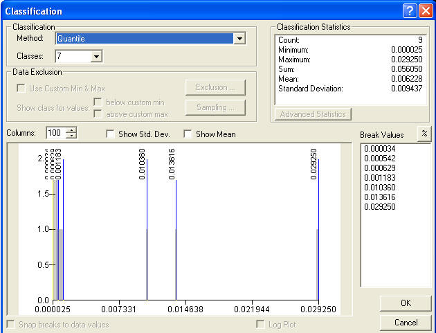
Having by some process decided the number of significant classes and how to reclassify your data to obtain these classes, a common component of each of these Compare Results tools is the ESRI Classification tool, typically used in Symbolization, shown below. When you start to compare two response themes, this window will appear for each and you can select the method of reclassification and the number of classes, just as is familiar in the Symbolization process. ESRI has some process to define the default number, which may or may not be appropriate. In order to successfully compare results it is necessary that both of the results to be compared have the same number of classes. So in many cases you will have to select the appropriate number of classes. Also, if you specify too many classes than the data will allow, the histogram window might be empty or the number of classes shown in the Break Values window will not coincide with your selected number of classes. Having decided the appropriate number of classes or ranks to use for the comparison, you are prepared for this task in the comparison.
Compare Results initially uses four classes (25% range). If the number is reduced to less than 4, then the data are very skewed. If the user chooses a larger number of quantile classes, the number of class breaks must the same as the number of classes, else the classifier has selected a lower number due to skewness. ESRI states the following about the process of selecting the number of classes: Description of Quantile CoClass
Quantile to create a classification (using IClassify ) that uses the quantile method to create classes. Quantiles have an equal (or close to equal) number of features in each class. The quantile method will handle skewed data (data where a high percentage of the features have same value, e.g., zero) by reducing the number of classes based on the degree of skewedness.
There is a known bug in Compare Results when used to compare responses within a SDMUC raster, for example to compare a logistic regression response with the associated weights-of-evidence response in the same SDMUC file. The Spearman's correlation will be reported as 1. While this number is generally about right for logistic regression and weights of evidence from the same evidence, the correlation between a Fuzzy Neural Network and RBFLN responses are often highly noncorrelated. So Compare Response only works properly when comparing between difference SDMUC files. A work around is to run a model twice so the weights-of-evidence response and the logistic-regression response or Fuzzy Neuraal Network and RBFLN responses are in separate SDMUC rasters.
| Next | Section Contents | Home |
![]()
How to use the Compare Results tool
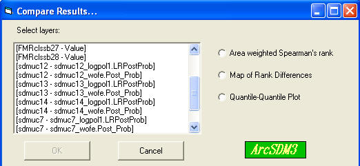
The box labelled 'Select layers:' lists all of the rasters available for comparison. The format for each item is [theme name . field name]. Valid inputs for comparison are the response grid themes in the active view, which includes products from WofE-LR Calculate Response, Fuzzy Logic, and Neural Networks Generate Neural Network Inputs. If a grid theme is based on a floating point grid, the field name is specified as 'Value' .
| Next | Section Contents | Home |
![]()
Area Weighted Spearman's Rank Correlation Coefficient
If data in one data set are being compared to data in another data set, the two data sets are combined to create a unique conditions grid so that ranks can be compared for the coincident areas. (If data from two fields in the attribute table of the same data set (grid them) are being compared this step is not necessary.) The data is transformed to ranks. The mean rank is calculated and the area associated with unique condition or polygon determined. An algorithm to calculate the following equation is used to calculate the coefficient:
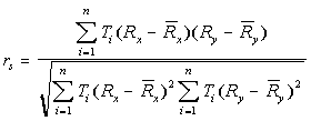
rs is reported in a table based on a dBase file.
rs varies from 1 (perfect correlation) through 0 (no correlation or independence) to -1 (perfect negative correlation).
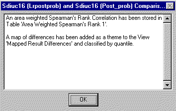
When processing is complete, the location of the table containing the Spearman's rank correlation coefficient and the name of the view containing the map of rank differences is reported:
| Next | Section Contents | Home |
![]()
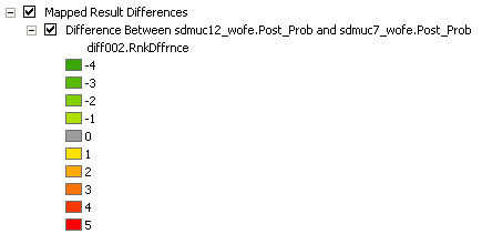
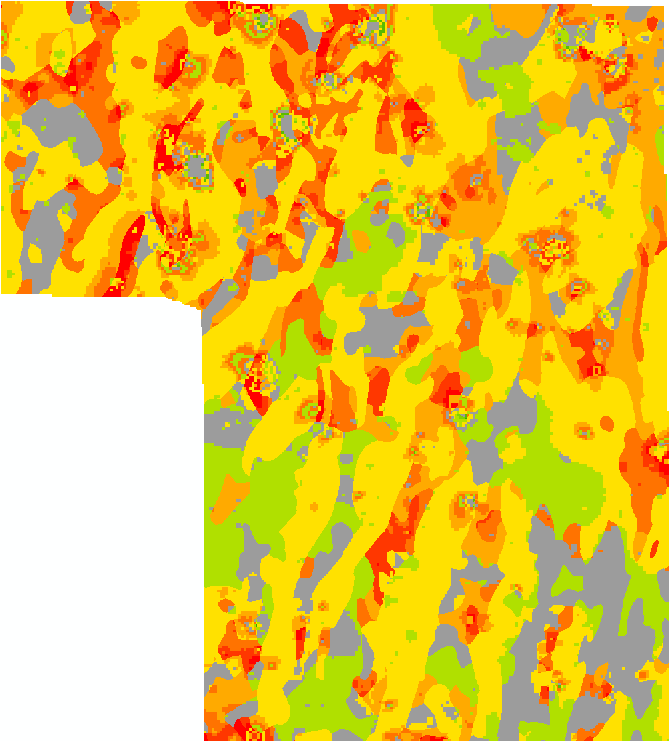
Ranks are generated as specified by the user. The grid themes being compared are reclassified by rank and a unique conditions grid is generated that is the basis of the map of rank differences. For each unique condition, the difference between the source ranks is calculated and appended to the attribute table, the RnkDffrnce attribute. It is this difference that is mapped. The map is primarily a visual tool: areas where the input maps match can be coloured grey; the greater the first ranked data is than the second, the greater the saturation of, for example, red; and the greater the rank of the second map is than the first, the greater the saturation of, for example, green. The user must select the symbolization.
| Next | Section Contents | Home |
![]()
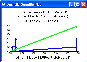
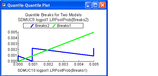
The grid themes being compared are reclassified, typically by the quantile method, and a unique conditions grid is generated. The input probabilities or fuzzy memberships of the input ranks are plotted against each other on an X-Y plot such as shown below on the left. The title at the top indicates that sdmuc14 wofe.Post Prob is Breaks2, the blue line. This file is plotted on the Y axis. The values for the X axis are labeled, in this case sdmuc13 logplo1.LRPost Probs. So the blue line is the plot of the responses from the two inputs. The green line is the a plot of equal values, a 1:1 plot. If both inputs had equal values, the blue line would be on the green line. The plot on the right below, shows another example comparing two logistic regression models. Note some aspects of these plots can be modified using the properties of the chart by right clicking on the blue title bar and selecting properties.
| Next | Section Contents | Home |
![]()